# Simple regression model
xyline <- function(x, a, b) {a + b * x}There are some R packages that help researchers to plot moderation (interaction) effects: The linear relations between x (independent variable / predictor) and y (dependent variable / outcome variable) for two or more levels of w (moderator). For example, I have been using visreg for multiple regression models fitted by lm() for a long time. It is simple to use and supports both base R graphics and ggplot2. stdmod, which I maintained, also has the function plotmod for plotting simple effects in moderated regression. For structural equation modelling, semTools can be used to plot interaction for latent variables using plotProbe(). plotProbe() can also be used to on observed variables using this workaround.
However, there may be case in which all we need is just two or more lines, and all we have are the simple effects: Two or more sets of intercepts of slopes.
This is how to plot the simple effect:
Suppose we want to plot the simple effects of x on y conditional on w (the moderator). From the output of some functions, we have the slopes and intercepts when w is “Low” or “High”:
w is “Low”: intercept = 2, slope = 1
w is “High”: intercept = 3, slope = 2
Write a simple function to compute the points
Set the range for x:
# Range of x
x <- c(0, 10)
Compute the predicted values of y at the lower and upper limit of the range of x, for each level of w, when all other predictors of y in the model, if any, are equal to zero:
# Generate the two points when moderator = "Low"
dat0 <- data.frame(Moderator = "Low",
                   x = x,
                   y = xyline(x, a = 2, b = 1))
# Generate the two points when moderator = "High"
dat1 <- data.frame(Moderator = "High",
                   x = x,
                   y = xyline(x, a = 3, b = 2))
Combine the datasets:
dat <- rbind(dat0, dat1)
dat
Moderator x y
1 Low 0 2
2 Low 10 12
3 High 0 3
4 High 10 23Draw the lines using ggplot2:
library(ggplot2)
p <- ggplot(dat, aes(x = x, y = y, color = Moderator)) +
            geom_line() +
            scale_color_manual(values = c("Low" = "blue", "High" = "red"))
p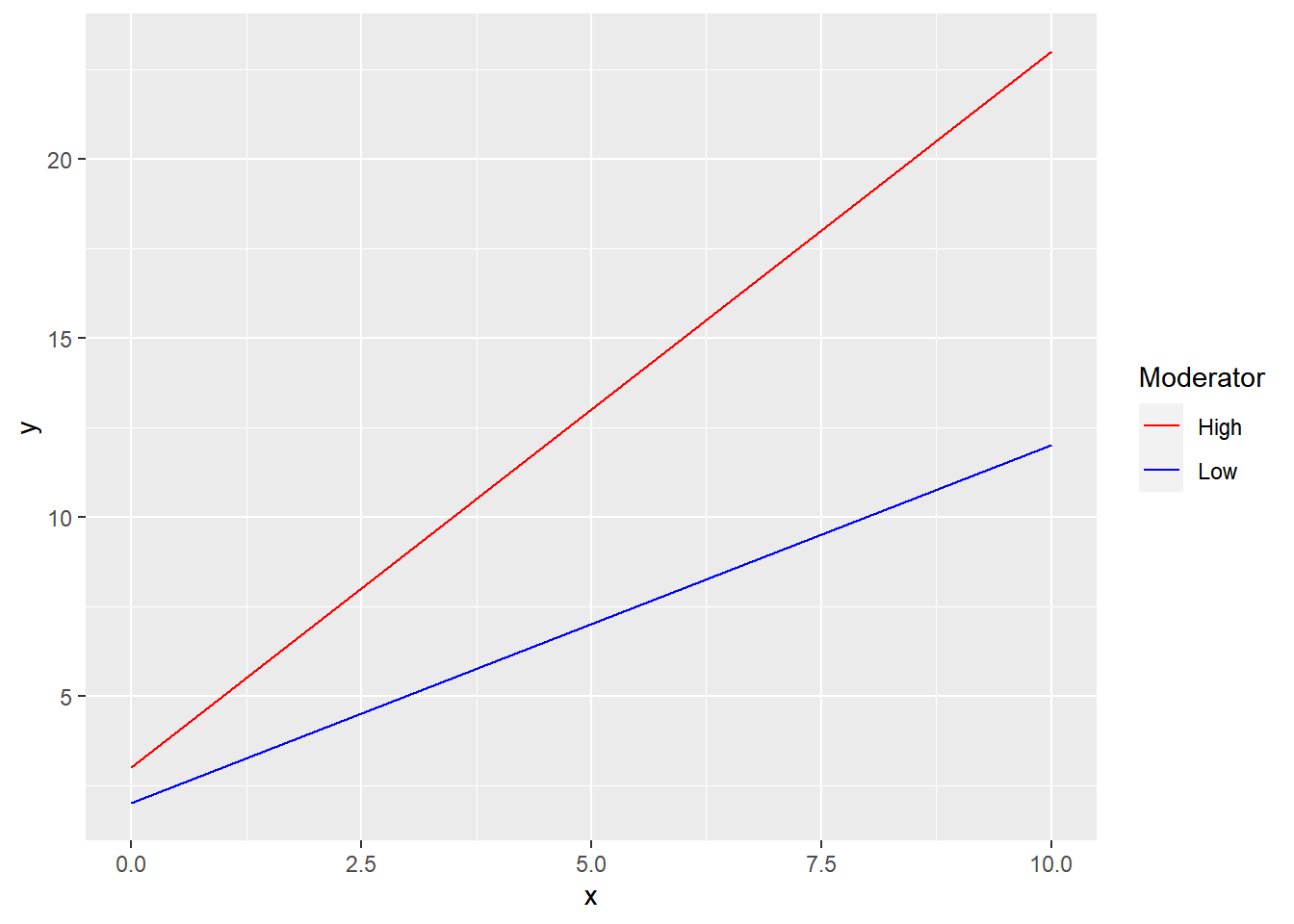
This plot can then be modified as necessary:
p2 <- p + xlab("Independent Variable") +
          ylab("Dependent Variable")
p2
This solution can be used for multiple regression or structural equation modelling.
Though not as elegant as using packages devoted to plotting moderation effects, this solution may be good enough for some simple scenarios. I believe it can be further improved. However, if we want more, maybe it is better to use packages like semTools and visreg.
P.S.: This post is based on a suggestion I posted to the Google Group for lavaan.
:::